UI, UX
Cateromarket
Summary
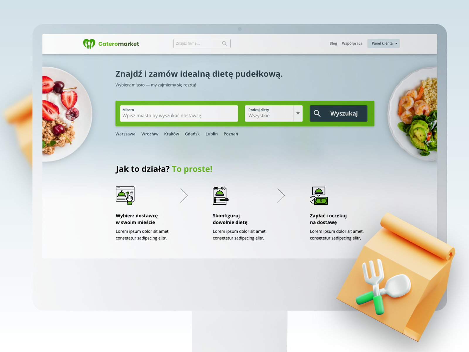
In the quest to improve the user experience of www.cateromarket.pl's checkout process, we used hotjar, competition audit and own experiences identify pain points, streamline the process, and ensure a seamless journey for users making purchases. Our focus was on enhancing clarity, reducing friction, and increasing trust in the platform.
Identified issues
- Complex Information Layout: The existing checkout process had a cluttered information layout, making it difficult for users to comprehend the steps required to complete their purchase.
- Lack of Progress Indicators: Users were unable to gauge how far along they were in the checkout process, leading to uncertainty and potentially abandoned carts.
- Unintuitive Form Fields: Form fields lacked clear labels and instructions, causing confusion and errors during data entry.
- Limited Payment Options: The existing payment options were limited, potentially discouraging users who preferred other methods.
- Mobile Responsiveness: The checkout process wasn't optimized for mobile devices, resulting in a poor experience for users on smaller screens.
UI /UX improvements :
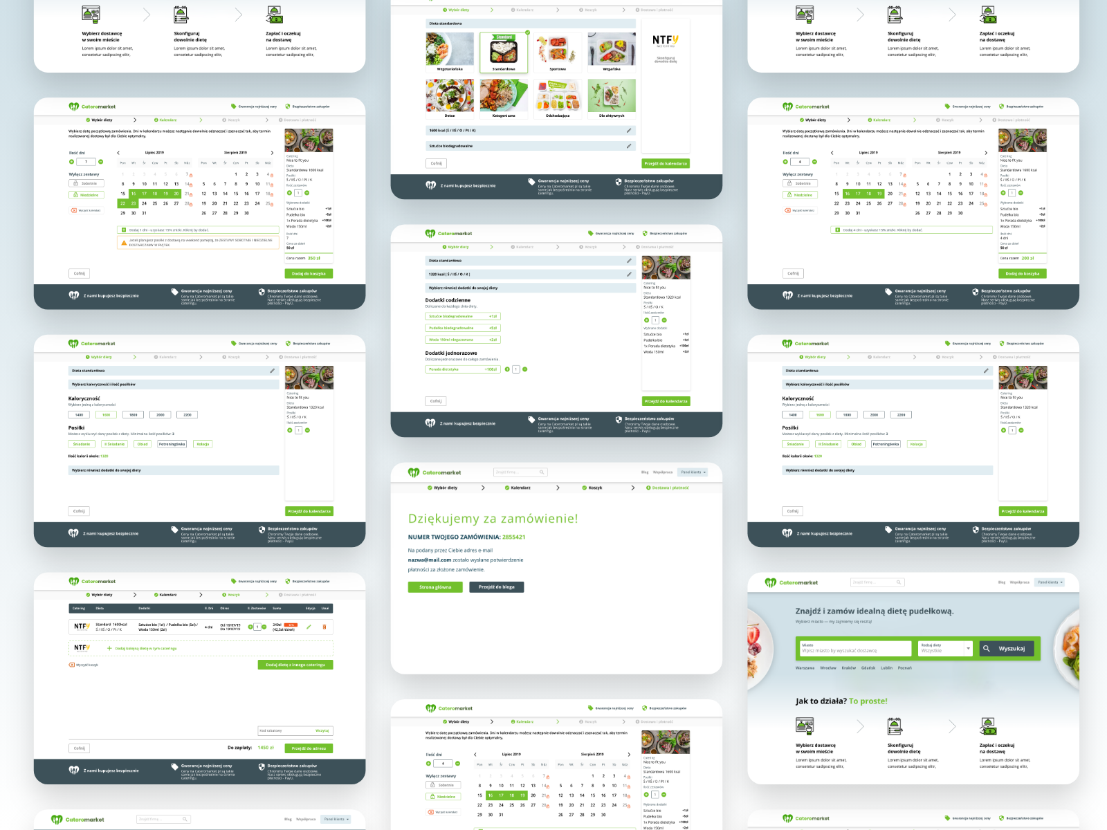
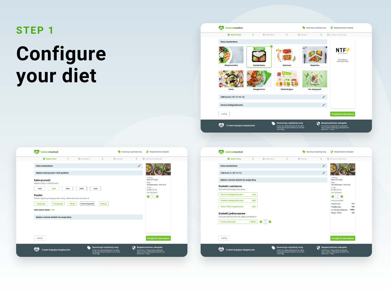
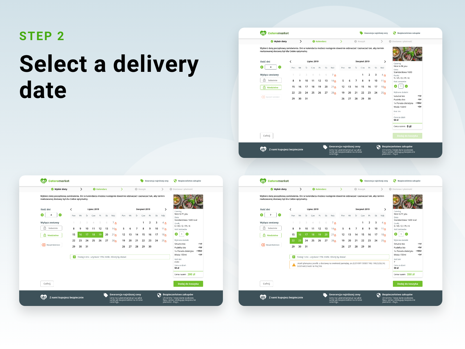
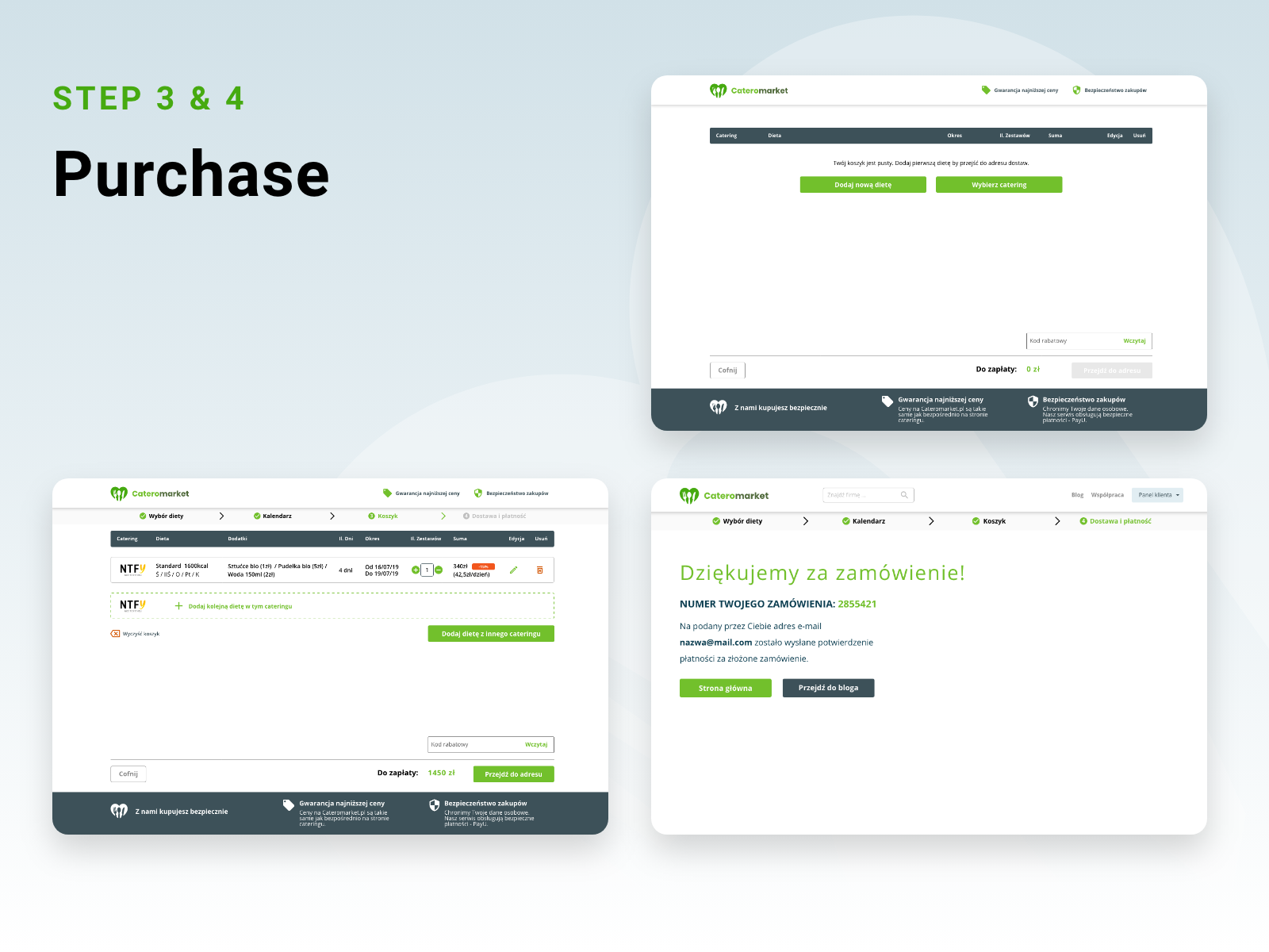
- Simplified Steps: We restructured the checkout process into clear and concise steps. Each step was accompanied by a progress indicator, providing users with a sense of control and transparency.
- Progress Tracker: A progress tracker was placed at the top of the page, showing users the current step and the steps remaining in the process.
- Clear Form Labels: We improved the labeling of form fields, ensuring each field was accompanied by a clear label and, where necessary, hints or examples.
- Mobile-Friendly Design: The entire checkout process was optimized for mobile devices, ensuring a smooth experience for users regardless of the device they were using.
- Visual Cues: The design incorporated visual cues such as checkmarks and color changes to indicate completed steps and successful actions, reducing uncertainty and increasing user confidence.
What we've done
1. Audit user needs
2. UX audit with Hotter
3. UI redesign
4. Prepare components for devs
Our Work
related work


let's talk
Ready to take off?

PELTONE SP. Z O.O.
Głowackiego 35/358;
LUBLIN (Poland)
P: +48 500 423 514
E: MPELINSKI@PELTONe.ART
Navigation
Work
follow us
UP